ShopDreamUp AI ArtDreamUp
Deviation Actions


Comments24
Join the community to add your comment. Already a deviant? Log In
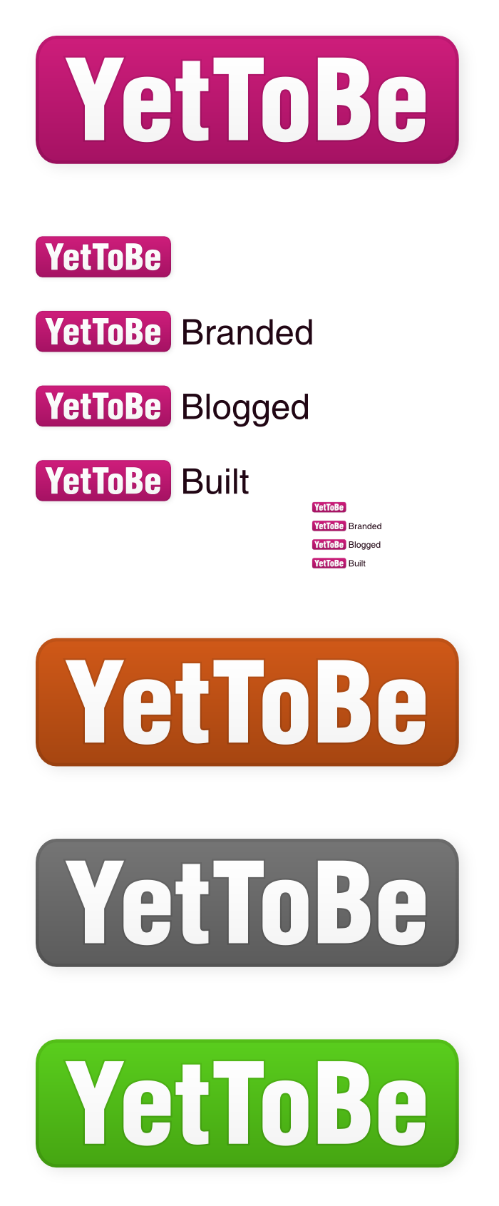
I also agree with `thespook's observations. What sticks out to me is that while rounded edges are certainly appealing, they're everywhere. Considering the paths web design has taken, I can see this logo blending in seamlessly with a design and never sticking out enough to carry its own weight.
I do enjoy the boldness of this. The bright colors are definitely a plus... even the gray seems radiant! You've also managed to maintain the minimalism in the way you've incorporated gradient and shadows which are usually a no-no in logo design. So, well done there!
As for my personal suggestions, I think this logo may work better without the round edges, and perhaps running vertically. I can see the text being light (or maybe even transparent), and the words sitting on top of each other all aligned to fit the rectangle of color in uniform width. Perhaps a little curl to an edge to slightly resemble a clothing tag? I'd also tweak a basic font a bit in one or two areas just to give it a one of a kind flair while still keeping a traditional and untouched feel that would fit the concept of the name, "yet to be".
Logo design is tricky if you're going for minimalism these days. It's definitely a trial to avoid displaying what you've already seen over the course of your life. I'm interested to see where this finally ends up :]